About Our Client
The Management Center (TMC) is working to advance justice and equity in the United States. Achieving this goal takes well-crafted strategies, winning over hearts and minds, and building power. It means transforming policies, systems, and structures that were never meant to serve our communities or planet. For managers and leaders, that also means a different approach to management. TMC helps social justice leaders build and run equitable, sustainable, and results-driven organizations.
Design Action Collective developed the identity, website, and collateral for The Management Center through a richly collaborative process.
“Throughout our brand refresh and website redesign processes, Design Action Collective felt like true partners in the work.”
They worked diligently to accommodate our needs and process, take and implement feedback, and gently nudged us out of our indecision when needed. They even jumped in to help us solve a big, unexpected problem with our existing website in the final stretch of the work.
Working with DAC means having skilled collaborators who will be communicative, accountable, and patient.”
— Monna Wong
Chief Content Officer
The Management Center (TMC) has a long history of working on campaigns for social justice. Their team is part of a robust ecosystem of trainers, coaches, content creators, and thought leaders dedicated to making our movements effective and supporting leadership development. Some members of the TMC staff even have history with Design Action Collective members from previous activism and organizing work. So when it came time for TMC to embark on a process to develop a new brand identity, they started a conversation with us.
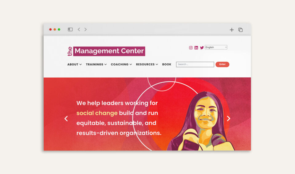
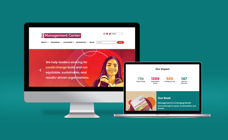
Over a series of meetings with TMC staff, Design Action Collective talked through their goals to refresh the existing logo and visual identity to more accurately reflect values of openness, inclusivity, and a human-centered approach to effective management. We understood that they had outgrown their original branding, and their existing communications tools and training materials lacked cohesion. Our task was to update their logo and larger branding to reflect TMC’s deep commitment to supporting racial equity and social justice in the workplace. Our plan was to deliver a new logo, a robust style guide, collateral templates, and a new website where all their public-facing content would be easily accessible.
BRAND DEVELOPMENT
Refreshed Logomark and Brand Elements
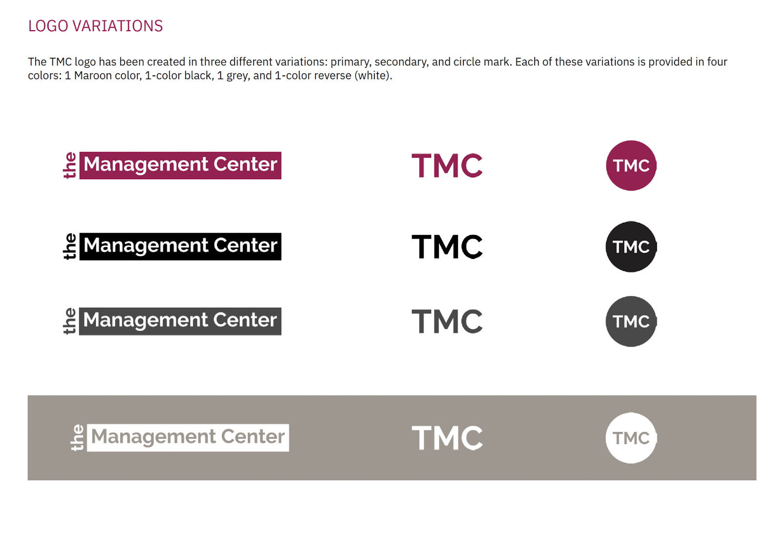
Any new logo process must first start with a series of questions that allows our design team to assess personality and perception. We were glad to see the TMC staff take these questions very seriously – creating an internal decision-making process to ensure everyone was on the same page. It became clear that a simple refresh of the color palette and letterform without making a dramatic departure from the original logo was the best way to proceed. After experimenting with a number of letterform styles, a final decision was made for The Management Center’s wordmark to be set in Poppins — a geometric sans-serif typeface. Using this versatile and minimalist font ensures readability across all content. Color blocking was used to highlight the word “Management Center” and a warmer shade of the original TMC maroon was embraced as the primary color for TMC’s identity.
However, a logo is just one component of an organization’s visual identity. We understood that the name “The Management Center” alone, with its minimal design, felt corporate and could be alienating to the very communities they were trying to serve. We discussed the kinds of visual cues that would appeal to real people seeking transformation for their teams and workplace cultures.
Extended Brand Guide
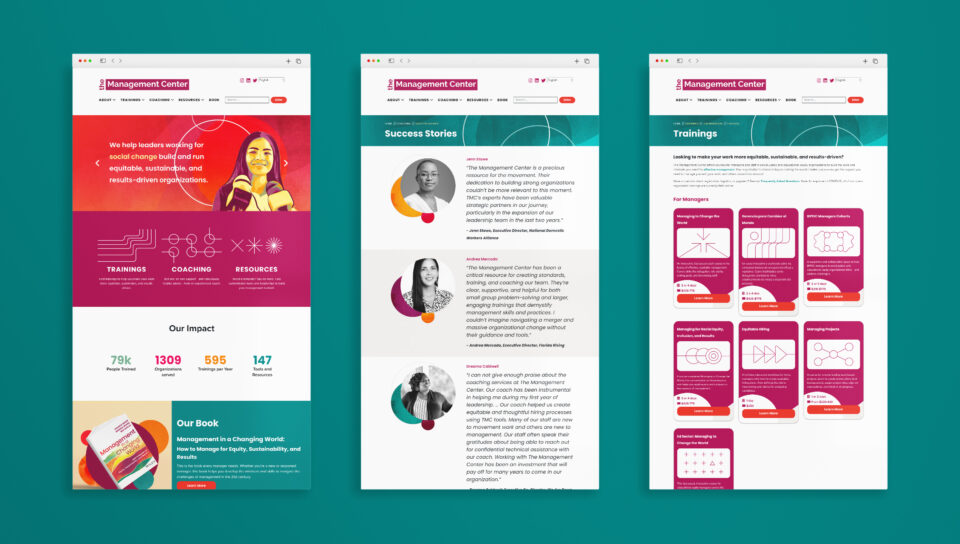
Inspired by the concept of re-imagination and collaboration, our team leaned into developing a visual language consisting of flowing textured patterns, soft organic geometric shapes, and illustrations to depict the communities TMC works with. This visual language became the basis for a range of illustrations and graphics that defined the overall style guide for TMC.
Developing the larger style guide was also an opportunity to set certain “rules” about font and color usage that would make all TMC materials feel cohesive. Our design team worked with TMC staff to make decisions that would help their audience see all their materials (be it social media posts, slide decks, books, website content or email newsletters) as coming from the same trusted source.
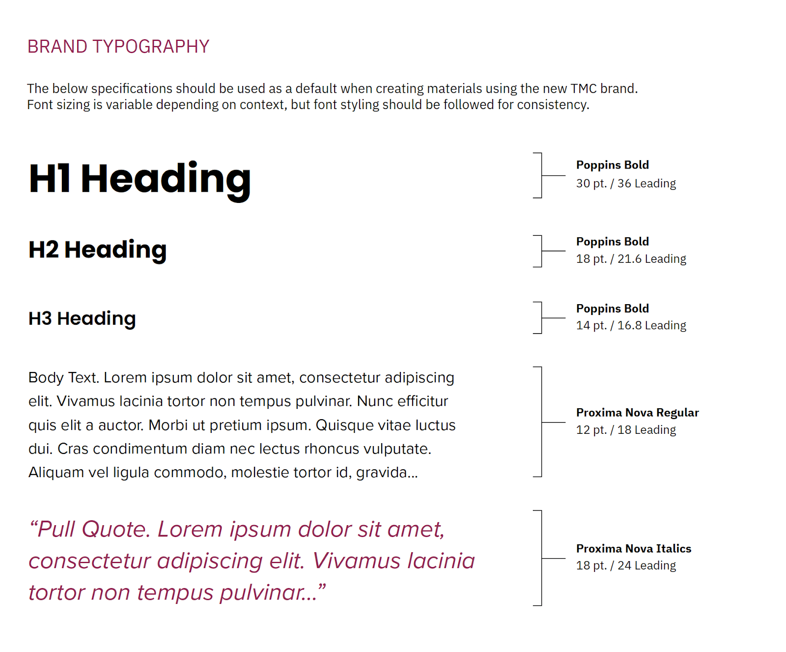
The font Poppins featured in the logo with its perfected circles and subtle charm would be the primary brand font. Proxima Nova was introduced as a secondary font. This font addition, with an informative, spacious feel that develops the visual language of openness, added to a welcoming tone when reading information throughout TMC’s materials.
A key focus while defining these style guide rules was to create a system that could flex and scale based on the audience. The bold wordmark can stand alone, but also quickly become inviting and lively when combined with shapes, textures, and illustrations. These graphic pairings are particularly useful for TMC’s promotion of trainings and reflect the culture and energy of the organization.
Social Media Templates
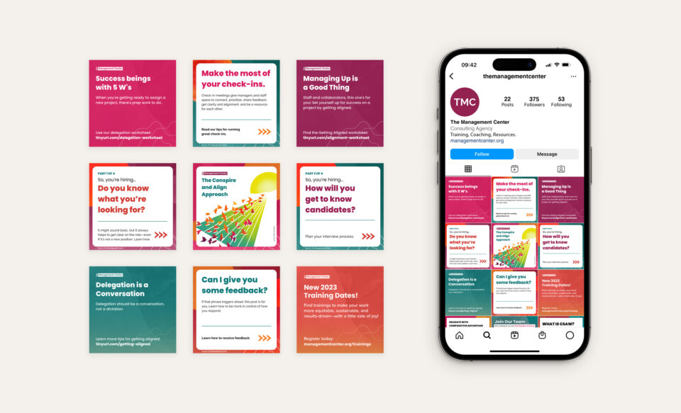
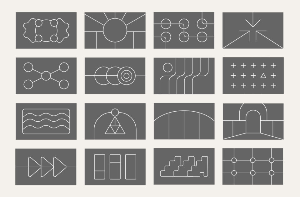
The palette and shapes are interpretations of the organic forms native to different seasons. The shapes and textures are imperfect and abstract, but when constructed into compositions, they give an expansive feeling encouraging big imaginations. In addition to the illustrative applications of the shapes, Design Action has created an abstract set of icons as part of the overall style guide. These visual assets, combined with a series of templates for print and digital collateral delivered as editable Google Docs, Slides, and Canva graphics, will allow TMC staff to generate a multitude of communications materials while staying accountable to the design and branding decisions made throughout their process with us.
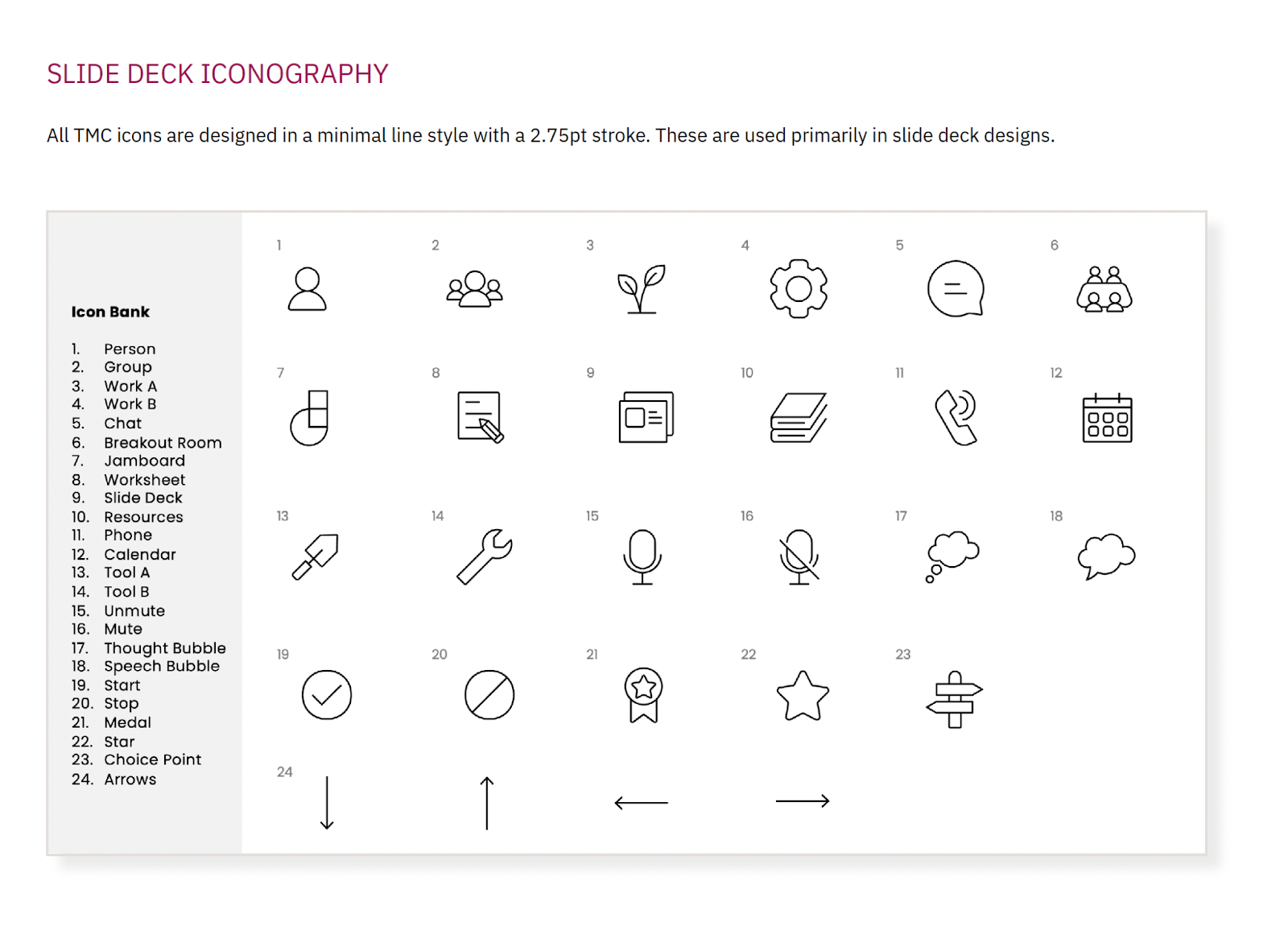
Custom Iconography
WEBSITE
Designing and Building an Accessible Resource
TMC holds themselves to high standards when it comes to accessibility. Our partnership with them helped us deepen our own practice around accessible design — working through tensions of aesthetics to ensure a robust, user-friendly experience for the website and other collateral. From the selected fonts to the color palette, our team tested readability and color contrast to consider a variety of users and the spectrum of visual needs.
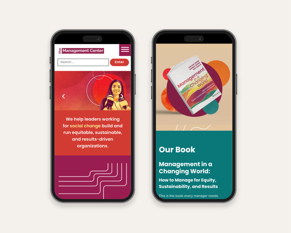
When it came time to design and build the new TMC website, we started by closely examining the site’s function. We went through a range of auditing with support from third-party services. We incorporated translated copy and implemented screen-reader accessibility through alt text, use of native HTML elements where possible and using WAI-ARIA as needed, and visual hierarchy; as well as other components like keyboard-accessible navigation, properly labeled form fields and error messages, readable color contrast combinations, among others. Centering these accessibility metrics when making design and development decisions resulted in a site that feels inviting, is easy to navigate, and addresses diverse user needs across multiple devices.
Another third-party service we incorporated was Arlo, which TMC uses to manage their training data – this was very important as offering training is a big part of the organization’s work. Some of the work included making sure their Arlo account was properly synching to the WordPress site, and seamless integration from the site to training registration from the visitors’ perspective. We worked closely with their IT contact through development until post-launch to make sure all moving pieces within the site were properly configured with their security plugin – Sucuri, and thus continue to provide security for their content and site administration in this new site.
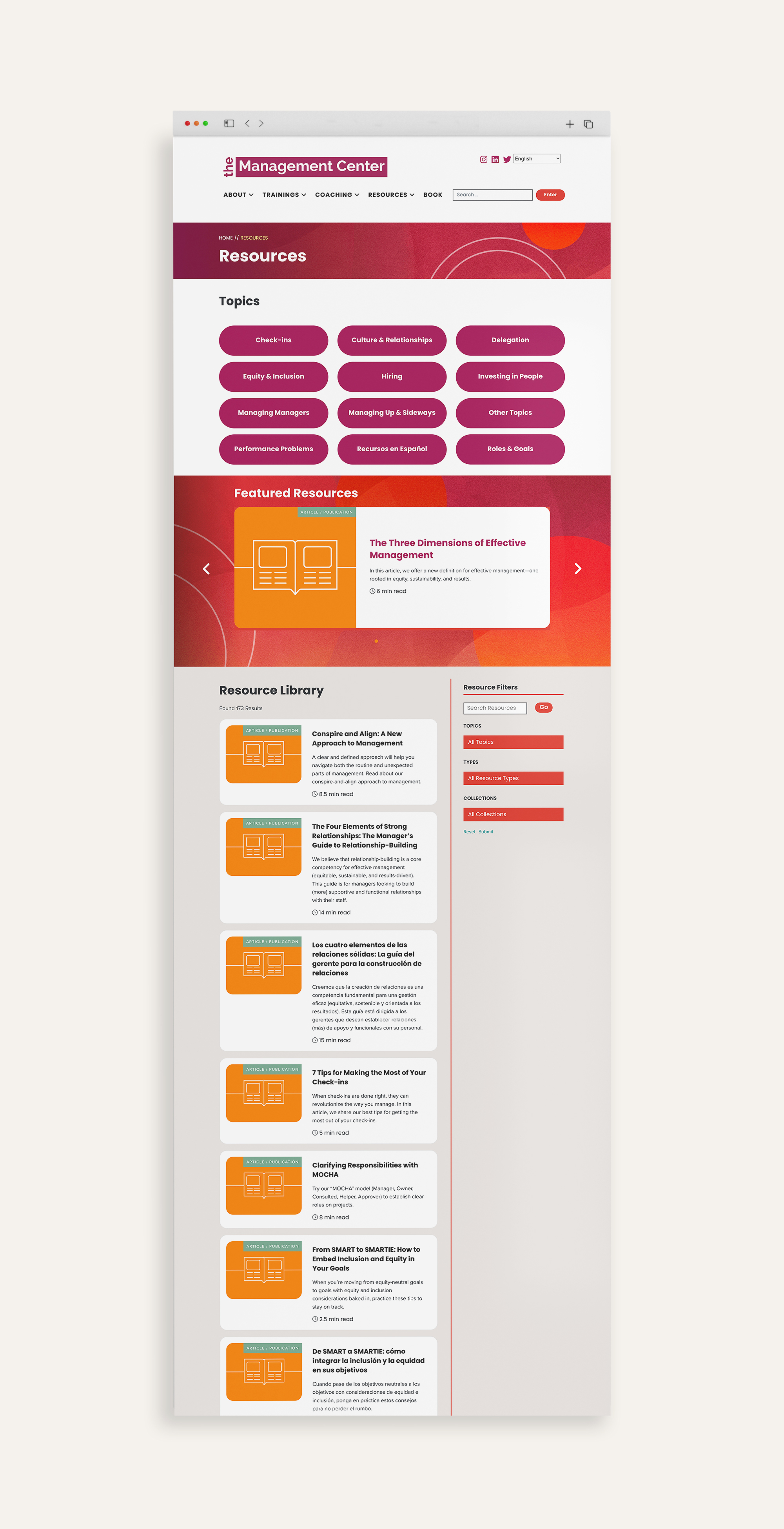
Finally, within their wordpress theme, we created a robust “Resources” view which houses hundreds of resources – it’s organized by filters, and includes downloadable files, and other intentional navigation decisions to make the high number of resources easy to access and parse through for users with varying levels of technical savviness.

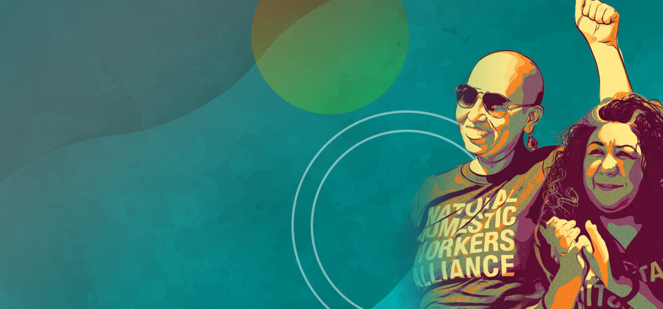


Custom Illustrations

PARTNERSHIP
A project of this scope with so many deliverables, requires a dedicated team on our client’s end and a coordinated effort amongst our own team of project managers, designers and developers. We are grateful that The Management Center chose to make this journey with us. We will apply lessons learned from this experience to future projects as we continue to evolve our services to meet the changing needs of our social justice movements.